photo by espn
The 2026 FIFA World Cup has not only delivered drama on the pitch but also ignited a full-blown jersey culture phenomenon. Designers have leaned heavily into cultural storytelling, local textiles, and bold historical references, turning kits into wearable statements of identity.
While some nations have stepped onto the world stage looking like fashion-week headliners, others have missed the mark entirely, sparking heated debate among fans and kit collectors alike. The result is one of the most visually diverse—and divisive—kit lineups in World Cup history.
The Good: Masterpieces of Modern Kit Design
A select group of teams have managed to strike the perfect balance between heritage, innovation, and visual appeal, earning widespread praise from supporters and designers.
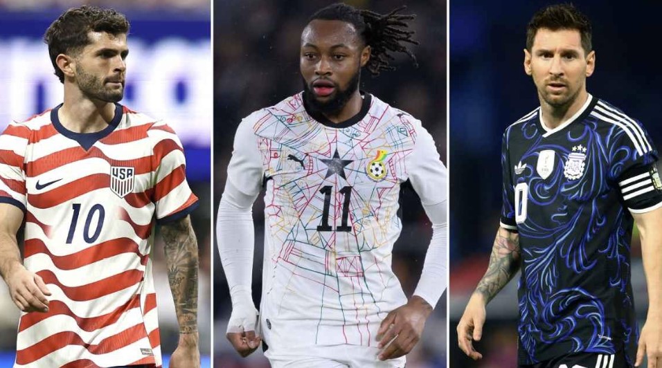
Argentina Home Kit
Widely regarded as the tournament’s standout design, Argentina’s home jersey reimagines the iconic sky-blue and white stripes with a refined three-tone gradient effect. Gold detailing commemorating world champion status elevates the design further, making it a symbolic farewell stage for Lionel Messi’s anticipated final World Cup appearance.
France Away Kit
France’s away kit is a masterclass in storytelling through design. Featuring a soft verdigris tone inspired by the Statue of Liberty’s copper patina, the jersey pays homage to France’s historic gift to the United States while embracing the tournament’s North American setting.
South Korea Home Kit
South Korea’s home shirt has emerged as a fan favorite hidden gem. At first glance, it appears as a clean, minimalist red design, but closer inspection reveals a subtle white tiger camouflage pattern woven into the fabric, blending elegance with cultural symbolism.
Curaçao Away Kit
Representing the smallest nation ever to qualify for a World Cup, Curaçao has won hearts with a clean, pastel-toned Adidas design. Its simplicity, balance, and confident restraint have made it one of the most celebrated fan-voted kits of the tournament.
The Bad: Missed Opportunities and Mixed Messages
Not all designs have landed successfully. Some kits suffer from overly complex ideas, confusing palettes, or execution that fails to match the ambition behind them.
Switzerland Away Kit
Switzerland’s away jersey has left fans puzzled with its bright green palette and heavy patterning. The design deviates sharply from traditional national colors, leading to confusion and comparisons with other teams, particularly Nigeria.
Algeria Home Kit
While the jersey’s green sleeve detailing has been praised, the front design features bold brown streaks that have divided opinion. Critics argue the effect distracts from the overall aesthetic, with some comparing it to unintended visual textures rather than intentional design work.
Belgium Away Kit
Belgium’s away kit attempts a modern artistic approach with a faded mint base and scattered pink accents. However, the execution has been widely criticized, with many fans describing the pattern as inconsistent and visually unsettling under broadcast lighting.
The Ugly: Chaos, Controversy, and Design Failures
A handful of jerseys have generated intense backlash, whether due to controversial aesthetics, manufacturing issues, or overwhelming visual clutter.
Ghana Home Kit
Ghana’s home jersey has become one of the most debated designs of the tournament. Intended to reflect Accra’s vibrant markets and Kente-inspired heritage, the shirt features a highly complex fractured pattern.
While the cultural inspiration is widely acknowledged, reactions have been sharply divided. Critics argue the execution is overly chaotic, with some comparing the visual effect to uncontrolled abstract patterns that overwhelm the eye.
Nike “Shoulder Flaw” Collection
Perhaps the most widely discussed kit issue of the tournament stems from a manufacturing and design flaw affecting multiple Nike kits, including France, Canada, Uruguay, and the United States.
The reinforced shoulder seams sit unusually high, creating rigid, protruding shapes that disrupt the natural drape of the jerseys. The result is a stiff, angular silhouette that has sparked widespread online mockery, with some fans comparing the look to ill-fitting suits or exaggerated sci-fi uniforms.
Nike has acknowledged the design issue publicly but confirmed that a mid-tournament correction is not possible due to large-scale production already being completed and distributed.
A Tournament Defined by Style as Much as Sport
The 2026 World Cup has made one thing clear: jerseys are no longer just uniforms—they are cultural statements, fashion pieces, and global talking points.
From celebrated masterpieces to controversial experiments, this year’s kits reflect a tournament where identity, creativity, and commercial design collide on the world’s biggest sporting stage.
Source: Omanghana